
When Earthfood’s landed in the Saket’s paradise, the creative challenge took a flight beyond Cloud Nine. Firstly, it was a food industry product, which we all loved to work on, and secondly, it was related to nature.
An idea of A new earth was sowed
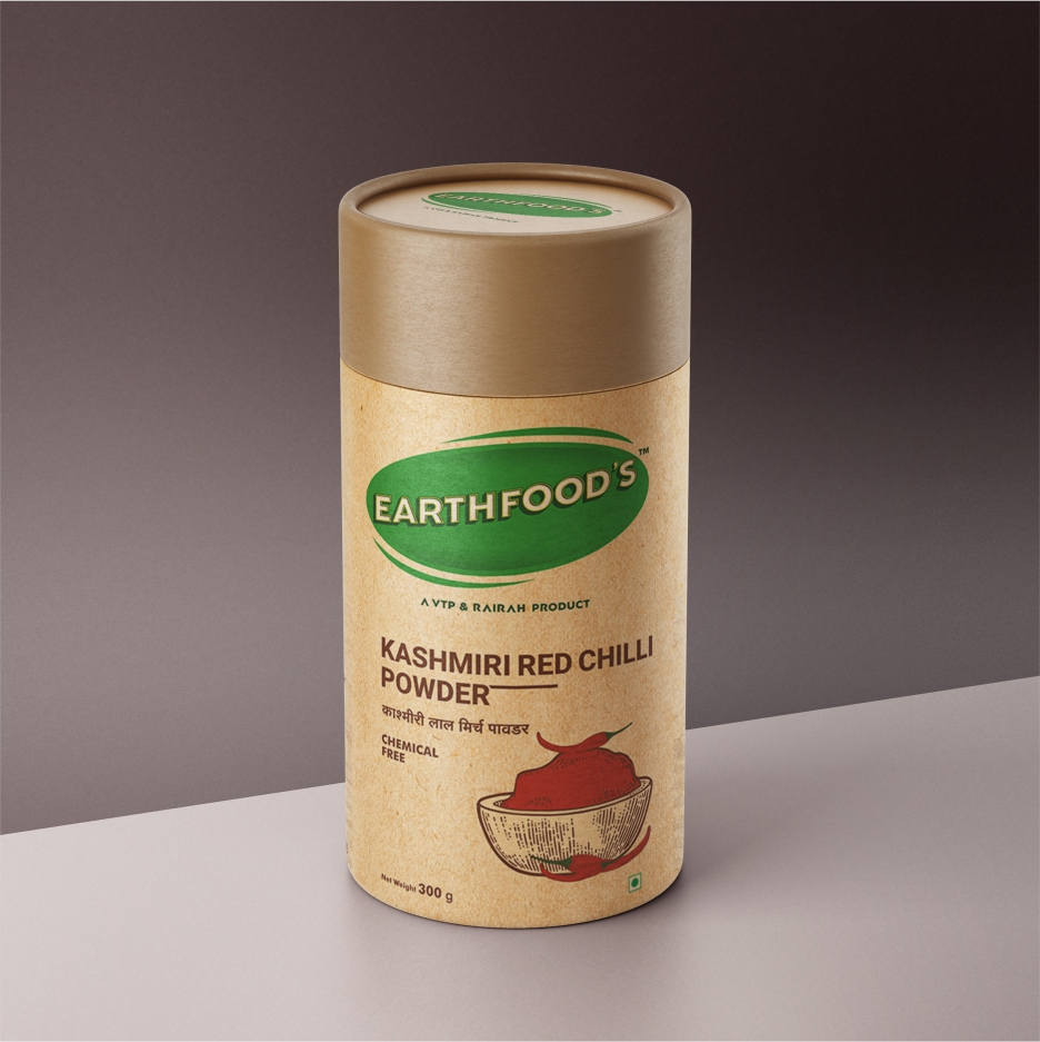
The task was to create a new perception about the brand that caters chemical-free products. The current logo didn’t have the power to attract the right audience. Saket Communications sowed the idea of a New Earth where nature was as abundant and refreshing as our health. And, nature was a universal entity which related to every human being. That’s how the new logo came to life. With groundbreaking (pun, intended) conceptual designs, Saket unearthed the true potential of the brand
Earthy, worthy & other-worldy design thinking
While we began to rethink about the brand’s true identity, our ideations birthed from the very soil the products did. And that’s how we decided to keep our design thinking grounded deeply into the roots. And so, we transformed the product packaging to the entire range of 34 products through the earthy essence. The core element of Earthfood’s was the subtlety and that was the only factor which made the products stand out.


We enhanced the brand’s health
With a fresh new logo design and product packaging created from the roots, Earthfood’s as a brand gained a new lease of life. The social media marketing gave a life support that the brand needed direly in the digital world to survive and that’s what Saket Communications did to enhance the brand’s health in the real world and in the digital one.
Saket Communications learned quite a few secrets about our very own Mother Earth as we unearthed many wonders of chemical-free products and learned distinctive ways in which one could live a healthy life. We applied the same formula to its brand and therefore gave the brand a completely natural makeover (pun, intended).


Leave a Reply